Fast food marketing is usually about delicious burgers and crispy fries, but sometimes the “friendly” faces representing these brands take a turn for the terrifying.
From uncanny valley animatronics to plastic-masked kings watching you sleep, some mascots are more likely to cause nightmares than hunger pangs.
Whether it’s coulrophobia-inducing clowns or strange singing rodents, these characters have left a lasting, albeit creepy, mark on pop culture.
Join us as we explore the top 10 scariest fast food mascots that prove some marketing ideas should have stayed in the kitchen.
1. The King (Burger King)
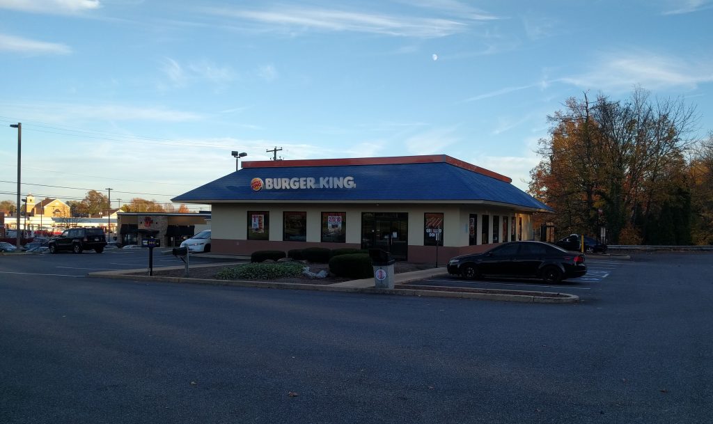
The Burger King is perhaps the most iconic example of a mascot gone wrong. With his frozen, plastic expression and oversized head, he leans heavily into the uncanny valley.
Marketing campaigns famously depicted him in unsettling scenarios, such as appearing outside people’s windows or even waking up in bed next to customers to offer a breakfast sandwich.
This silent, unblinking presence transformed a royal figure into a certified “creep”. For marketers, this serves as a lesson: while brand recognition is vital, crossing the line into intrusive horror can overshadow the product itself.
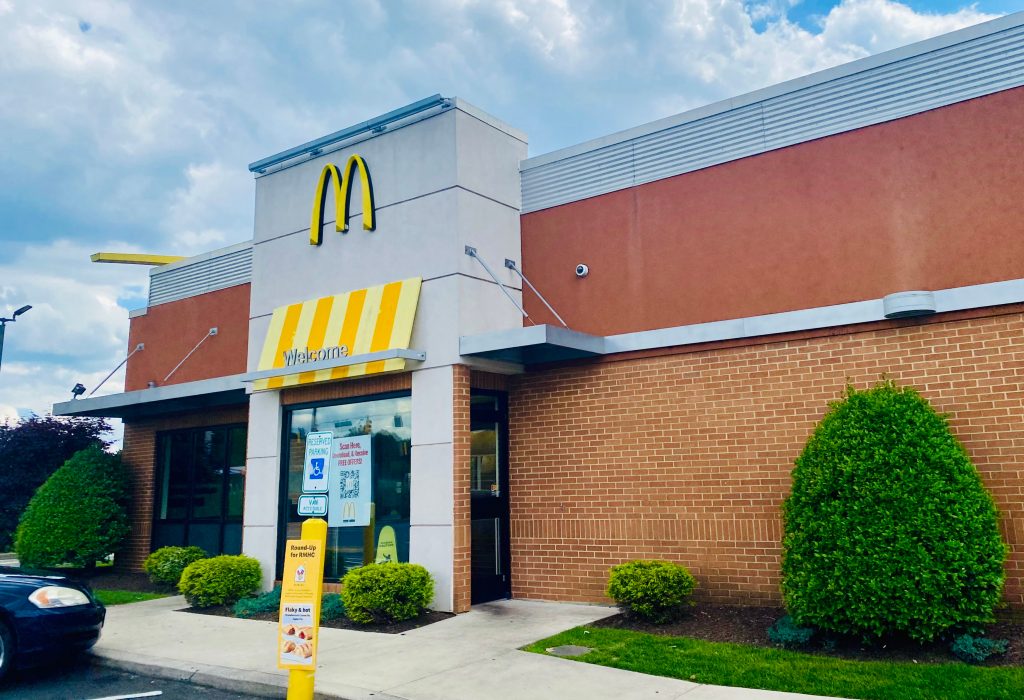
2. Old School Ronald McDonald (McDonald’s)
Before he was a polished cartoon, the original Ronald McDonald was a sight to behold. Early iterations featured a much more disheveled appearance that many found disturbing.
Sources mention a Japanese advertisement where he was even depicted hiding under a bed.
This “old school” version is so unsettling that modern media, such as the film The Founder, explores how the mascot’s image can be genuinely frightening to the point of causing accidents.
It’s a prime example of how vintage branding can age poorly, turning a symbol of joy into a source of nostalgic dread.
3. Modern Ronald McDonald (McDonald’s)
Even the updated version of Ronald McDonald struggles to escape his scary reputation. For many children and adults, he remains a primary trigger for coulrophobia, or the fear of clowns.
Despite efforts to make him look more friendly and approachable, the heavy face paint and exaggerated features often have the opposite effect.
In the world of brand psychology, clowns are polarizing; what is meant to be whimsical can easily feel threatening.
Modern Ronald reminds us that humanoid mascots require careful design to avoid triggering deep-seated psychological fears in the target audience.
4. Mister Softee (Mister Softee)
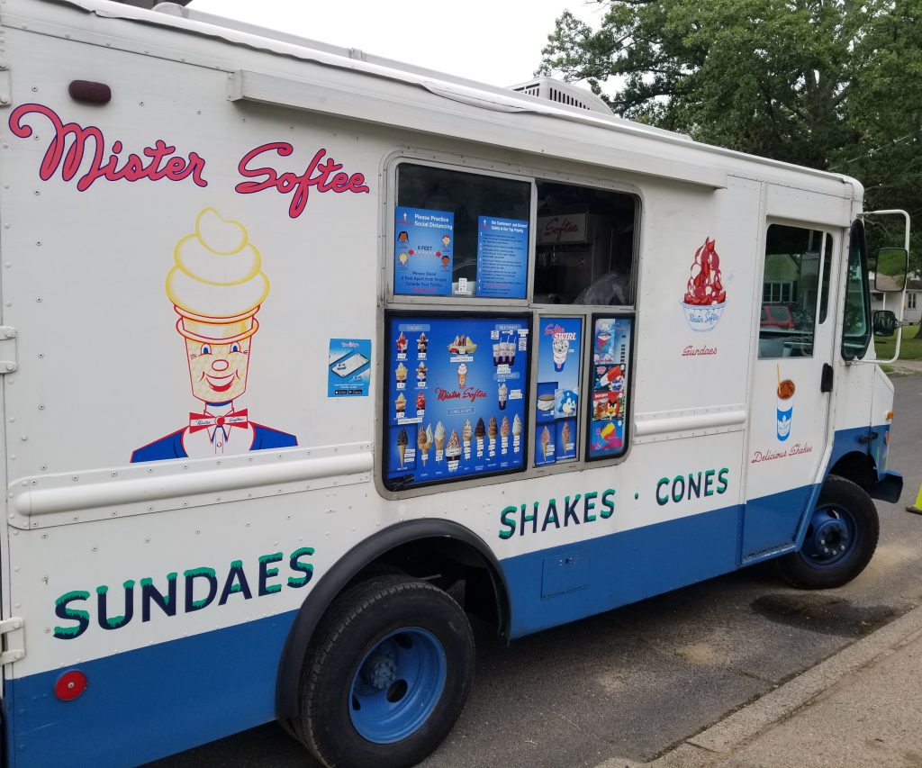
While the ice cream is a summer staple, the mascot Mister Softee is often described as “too creepy for anybody”.
His oversized, cone-shaped head and wide-eyed stare can be off-putting rather than inviting. Interestingly, this mascot served as the inspiration for the character Mr. Tastee in the cult classic show The Adventures of Pete & Pete, further cementing his status as a bizarre cultural icon.
For business owners, the takeaway here is that oversized head costumes often lack the emotive range necessary to connect warmly with customers, leading to a “blank stare” effect.
5. Jack Box (Jack in the Box)
Jack Box is a mascot with a long, strange history. While he had a “cute” phase in the 1970s, the 1950s version is widely considered the most terrifying.
The modern iteration, featuring a man in a business suit with a giant, unmoving spherical head and a pointed yellow hat, is equally polarizing.
Critics have even written songs about his “creepy” nature and “gross” food. From a User Experience (UX) perspective in advertising, Jack’s design is high-risk; his lack of facial movement creates a barrier that can make some consumers feel deeply uncomfortable.
6. The Noid (Domino’s Pizza)
The Noid was a claymation gremlin in a red rabbit suit designed to “avoid the Noid” and keep your pizza fresh. However, his manic energy and strange design made him more of a villain than a brand ambassador.
While some don’t find him traditionally scary, his erratic behavior and the chaotic marketing surrounding him created a sense of unease.
For SEO specialists, “The Noid” remains a highly searched term due to his infamous history, proving that even a “scary” mascot can maintain high brand recall decades after being retired from mainstream use.
7. Happy the Happy Meal (McDonald’s)
McDonald’s attempted to give the Happy Meal box a personality with Happy, but many consumers found him more “annoying” and “scary-looking” than cute.
With his massive, wide-open mouth and bulging eyes, he was intended to represent excitement but often landed in the territory of visual overstimulation.
Some critics argue he should be at the top of the list for sheer visual discomfort. This serves as a reminder that simplistic designs can backfire if the proportions are exaggerated to a point that feels unnatural or aggressive to children.
8. Jollibee (Jollibee)
The Jollibee bee might look cheerful at first glance, but some find the mascot’s physical form unsettling.
Specifically, critics have noted that the eyes on the mascot suit can move in a way that mimics FNAF (Five Nights at Freddy’s) animatronics.
This mechanical movement adds an unintended layer of horror to a character meant to represent joy and fast food.
For companies using robotics or animatronics in their branding, it is crucial to ensure movements are fluid and natural to avoid the “robotic horror” trope that can alienate younger customers.
9. The Quiznos Rat (Spongmonkeys)
Perhaps one of the most baffling choices in advertising history was the Quiznos Rat (technically known as Spongmonkeys).
These “contenders” for the scariest mascot title featured screeching, bug-eyed, rodent-like creatures singing about toasted subs.
While the campaign was memorable, it was largely due to the disturbing visuals and high-pitched voices that many found repulsive rather than appetizing.
This is a classic case study in shock marketing; while it certainly grabs attention and improves search visibility, it risks associating your food products with unhygienic or frightening imagery.
10. Chuck E. Cheese (Chuck E. Cheese)
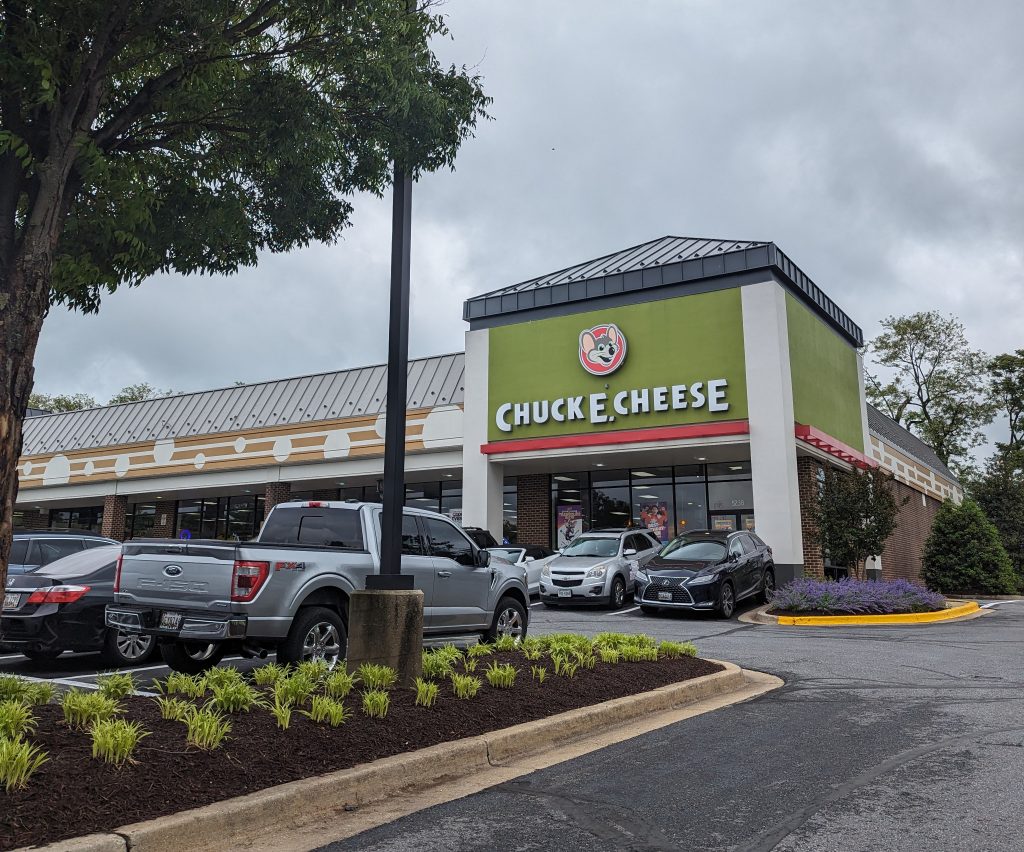
Finally, we have Charles Entertainment Cheese, the mouse who has haunted pizzerias for decades. Many people find the animatronic version of this character “super scary”.
The jerky movements and fixed, wide-eyed expressions of the animatronic band have become a staple of “creepy” childhood memories.
As brands move toward digital engagement, the legacy of Chuck E. Cheese highlights the shift from physical animatronics to digital avatars, as the former often carries a “haunted” quality that modern audiences find more frightening than fun.
Encountering these mascots is like finding a surprise toy in your cereal box, only to realize it’s a realistic plastic spider—it certainly gets your attention, but perhaps not for the reasons the manufacturer intended.
Declan Kelly