The Boston Celtics’ logo history is a visual journey that reflects the iconic basketball franchise’s evolution and enduring legacy.
From its inception in 1946 to today, the Celtics’ logos have become symbols of the team’s identity and success.
This exploration will trace the changes in design, colour schemes, and symbolic elements, shedding light on the creative decisions accompanying the team’s growth and achievements.
The Celtics’ logos represent the team’s brand and mirror the dynamic narrative of its storied history in the NBA.
Join this visual retrospective to understand how the Boston Celtics’ logos have evolved over the years, capturing the essence of a team that stands as a basketball powerhouse with an enduring and recognizable visual identity.
Boston Celtics Logo?
The Boston Celtics logo is a distinctive and iconic emblem reflecting the rich history and tradition of one of the most storied franchises in the history of the NBA.
Executed in a vibrant combination of white and green, the logo features a leprechaun dribbling a basketball, capturing the essence of the team’s Irish heritage and its prowess on the basketball court.
Color Scheme
The entire logo is meticulously crafted in a palette of white and green, with a subtle yet defining thin black outline.
The choice of colours is significant, as white symbolizes purity, cleanliness, and the pursuit of perfection, while green is traditionally associated with growth, progress, and renewal.
In the context of the Boston Celtics, this colour combination represents the team’s commitment to continuous improvement, both on and off the court.
The Symbolism of White and Green
The white and green colour scheme goes beyond aesthetics, conveying deeper meanings that resonate with the values of the Celtics organization.
Green, being the dominant colour, symbolizes growth and progress, emphasizing the team’s dedication to developing its players, fostering a winning culture, and evolving as an organization.
It reflects a sense of renewal and optimism, encapsulating the ongoing pursuit of excellence.
Incorporation of Black
Adding a layer of sophistication to the logo is the thin black outline. Black is a colour associated with stability, expertise, and professionalism.
In the context of the Boston Celtics logo, it signifies the team’s enduring legacy, seasoned experience, and commitment to maintaining a high standard of excellence.
The combination of black with white and green reinforces the Celtics’ image as a powerhouse in the NBA, with a rich history grounded in stability and expertise.
The Boston Celtics logo is not merely a visual representation of the team but a carefully designed emblem that encapsulates the franchise’s values, traditions, and aspirations.
The choice of colours, with white and green representing growth and progress, complemented by the stability and professionalism conveyed through black, collectively creates an emblem that embodies the Celtics’ commitment to success and loyalty.
The Roots of Boston Celtics Logo History
The Boston Celtics logo has a rich history that reflects the team’s deep-rooted traditions and the cultural significance of its Irish heritage. The evolution of the logo can be traced back to the franchise’s early years.
Here’s an overview of the roots and history of the Boston Celtics logo:
Founding Years (1946-1950s)
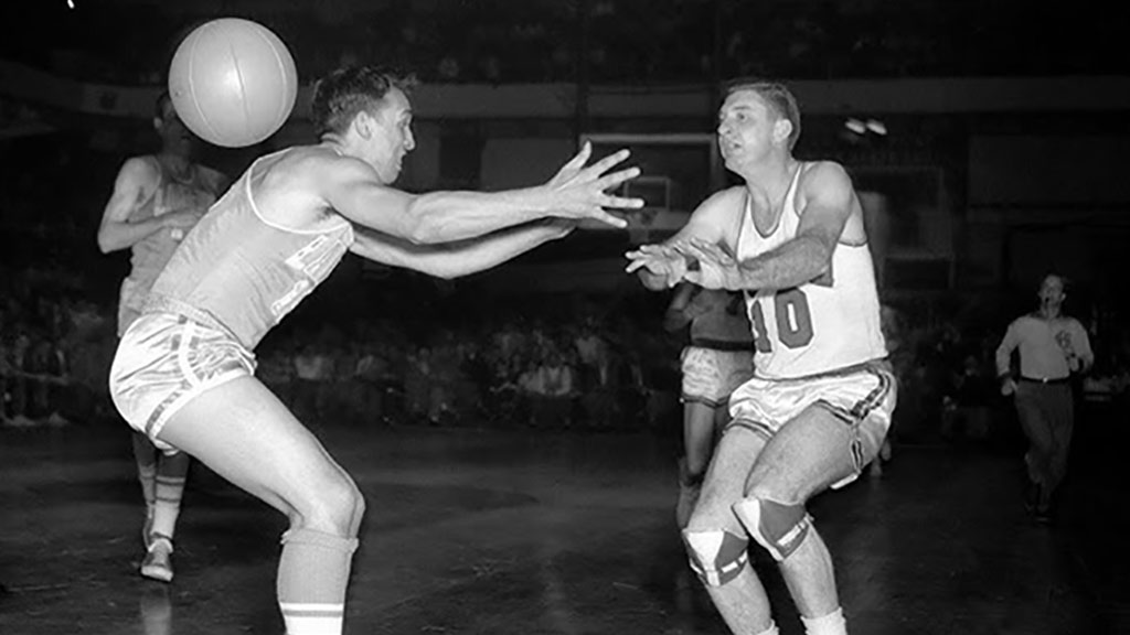
The Boston Celtics were founded in 1946, and the team did not have a formal logo in the early years.
The focus was primarily on establishing the team in the newly formed Basketball Association of America (BAA), which later merged with the National Basketball League (NBL) to become the NBA.
During this period, team branding was minimal, and logos were not as prominent as they are today.
Introduction of the Leprechaun (1950s)
The iconic leprechaun, a symbol of Irish folklore, debuted in the late 1950s as part of the team’s visual identity.
The leprechaun, depicted dribbling a basketball, became a distinctive and enduring symbol of the Boston Celtics. This edition celebrated the team’s Irish heritage and added a unique and memorable element to the logo.
Evolution of Typography (1960s-1970s)
During the 1960s and 1970s, the Celtics’ logo underwent subtle changes, particularly in the typography used in team branding.
The lettering associated with the team’s name and other logo elements evolved to align with the design trends of that era. These changes were part of a broader shift in sports branding during that period.
Consolidation of Iconic Elements (1980s-Present)
The 1980s saw the consolidation of the iconic elements that define the Boston Celtics logo today. With its mischievous yet determined expression, the leprechaun became a beloved symbol for fans.
The colour scheme of green and white, representing Irish heritage and purity, was solidified. The logo achieved a timeless quality that has endured over decades.
Digital Age Adaptations (2000s-Present)
As technology and digital media gained prominence, the Celtics logo adapted to meet the demands of various platforms.
Digital versions of the logo were optimized for use on websites, social media, and other digital applications while maintaining the integrity of the traditional design.
Throughout its history, the Boston Celtics logo has remained remarkably consistent, a testament to the enduring strength of the team’s brand.
Incorporating the leprechaun and the distinctive colour palette has created a visually appealing emblem and fostered a sense of identity and pride among fans.
The logo’s roots in Irish folklore and its evolution over the years reflect a commitment to tradition and a connection to the community, making it one of the most recognizable and iconic symbols in the world of sports.
Influence of Graphic Design Trends on the Boston Celtics’ Visual Identity
Like many professional sports teams, the Boston Celtics have been influenced by graphic design trends over the years, adapting their visual identity to stay relevant and resonate with fans.
While the core elements of their iconic logo have remained consistent, subtle changes and updates have reflected broader design trends.
Here are a few ways in which graphic design trends have influenced the Boston Celtics’ visual identity:
Simplicity and Minimalism
There has been a trend towards simplicity and minimalism in graphic design in recent years. The Celtics’ logo has always been relatively simple, but modern updates may have emphasized cleaner lines and a more streamlined look.
Minimalistic design ensures that the logo remains easily recognizable and versatile across various applications, including digital media and merchandise.
Digital Adaptation
With the rise of digital media and the increasing importance of online presence, graphic design has shifted towards creating effective visuals in digital formats.
The Celtics’ visual identity has likely adapted to this trend, ensuring that their logo looks sharp and impactful on screens of various sizes. This could involve adjustments to the colour palette, proportions, or other details that enhance digital visibility.
Evolution of Typography
While the Celtics’ logo primarily features imagery rather than typography, the team’s use of typography in branding, marketing, and merchandise could be influenced by contemporary design trends.
Clean and bold fonts, in line with current typographic preferences, may be incorporated into promotional materials and digital platforms associated with the team.
Dynamic Branding
Modern graphic design often emphasizes dynamic and adaptable branding. The Celtics may have explored variations of their logo or additional visual elements to use in different contexts, such as social media graphics, special events, or collaborations.
This flexibility ensures that the brand remains fresh and engaging while staying true to its core identity.
Incorporation of Storytelling
Graphic design trends often emphasize storytelling through visuals. The Celtics’ logo and associated graphics may integrate narrative elements, celebrating the team’s history, achievements, or community engagement.
This approach can connect with fans more deeply by conveying a sense of identity and shared experiences.
It’s important to note that the Boston Celtics, with a strong and timeless visual identity, may not undergo radical changes in response to every passing design trend.
Instead, the team is likely to selectively incorporate elements that enhance their brand while maintaining the classic and recognizable aspects that have made their visual identity enduring and iconic.
The balance between tradition and contemporary relevance is key in navigating the influence of graphic design trends on the Boston Celtics’ visual identity.
Modernizing Traditions in Boston Celtics Logo History
The Boston Celtics have modernised their traditions while preserving the essence of their iconic logo throughout the team’s history.
Here’s how the Celtics have successfully balanced tradition and modernization in their logo design:
Timeless Core Elements
The Celtics have maintained the timeless core elements of their logo, such as the leprechaun and the green-and-white colour scheme. These elements are deeply rooted in the team’s history and Irish heritage.
By preserving these iconic components, the Celtics have ensured a sense of continuity and recognition among fans, creating a lasting connection to the team’s legacy.
Subtle Design Refinements
While staying true to tradition, the Celtics have made subtle design refinements to keep their logo current. Over the years, typography, shading, and detailing adjustments have been made to align with contemporary design aesthetics.
These refinements are often subtle enough to go unnoticed by casual observers but contribute to a more polished and modern appearance.
Digital Adaptations
The team has successfully adapted its logo for the digital age without compromising its traditional elements.
Digital adaptations involve optimizing the logo for various digital platforms, ensuring that it remains visually striking on websites, social media profiles, and other online applications.
This approach allows the Celtics to connect with a broader and tech-savvy audience.
Alternate and Special Edition Logos
The Celtics have introduced alternate and special edition logos to embrace modern design trends and engage fans in different ways.
These variations often incorporate contemporary design elements or creative interpretations of the traditional logo.
These alternate logos are frequently used for marketing campaigns, merchandise, and special events, providing flexibility while maintaining the core brand identity.
Collaborations and Limited Editions
The Celtics have explored collaborations with artists and designers to create limited-edition logos or merchandise.
These collaborations infuse fresh perspectives and modern design sensibilities while still paying homage to the team’s traditions. Limited-edition releases allow the team to experiment with new concepts and connect with diverse fan interests.
Emphasis on Storytelling
Modernization in the Celtics’ logo history is not just about aesthetics but also about storytelling. The team has used visual elements to tell a narrative and celebrate milestones, anniversaries, or community engagement.
This approach creates a dynamic connection with fans by conveying a sense of identity and shared experiences.
By strategically modernizing their logo and brand elements, the Boston Celtics have managed to stay relevant in a rapidly changing sports and design landscape.
The balance between preserving tradition and embracing modern design trends has allowed the team to maintain a strong and enduring visual identity while connecting with fans across generations.
The Celtics’ ability to evolve without losing their core identity is a testament to their understanding of the importance of both tradition and contemporary appeal.
FAQs
What is the significance of the leprechaun in the Celtics’ logo?
The leprechaun in the Boston Celtics logo nods to the team’s Irish roots.
Introduced in the late 1950s, the leprechaun symbolizes Irish folklore and has become an enduring and beloved emblem, representing the team’s identity and cultural heritage.
How has the Boston Celtics logo adapted to digital trends?
In response to the digital age, the Celtics have optimized their logo for digital platforms. This includes subtle adjustments for online visibility while preserving the traditional design elements.
The team ensures that its logo remains visually striking on websites, social media, and other digital applications.
Has the Boston Celtics logo undergone major redesigns?
A: No, the Boston Celtics logo has not undergone major redesigns. While there have been subtle refinements, the core elements, such as the leprechaun and the green-and-white colour scheme, have remained consistent since the 1980s. ‘
This stability reflects the team’s commitment to tradition and recognition.
How does the Boston Celtics balance tradition and modernization in their logo?
The Celtics balance tradition and modernization by maintaining timeless elements like the leprechaun and green colours while making subtle design refinements to stay current.
They also explore alternate logos, collaborations, and limited editions to infuse modern design trends, ensuring a dynamic visual identity that resonates with diverse fan interests.
Wrapping Up
In tracing the Boston Celtics logo history, we find a journey marked by a delicate balance between tradition and modernization.
The emblem has stood the test of time, from the introduction of the leprechaun in the 1950s to the subtle design refinements in recent years.
The Celtics’ commitment to their Irish heritage and iconic elements and strategic adaptations for the digital age exemplify a harmonious blend of the old and the new.
This evolution preserves the team’s rich legacy and ensures its visual identity remains dynamic, engaging, and relevant to fans across generations.
Jaclyn Lowe